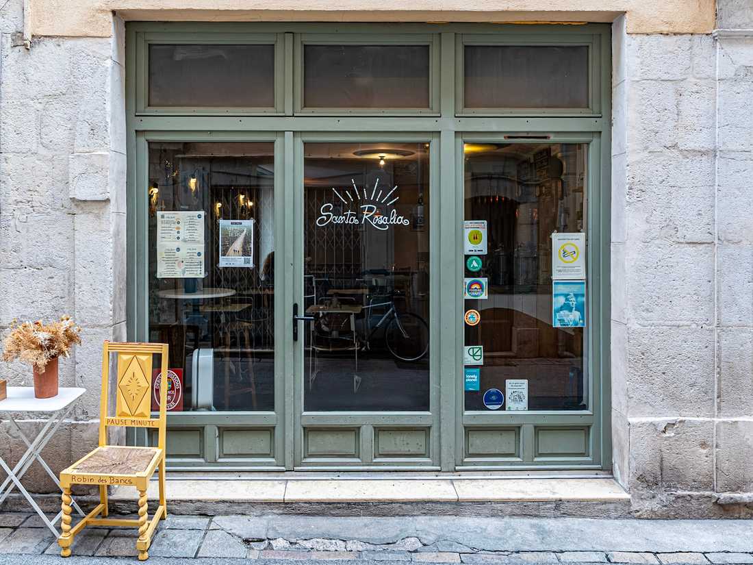
Interior remodeling of a restaurant in Toulon
- Project Objective: To expand the central counter and create a gourmet grocery area.
- Materials: Pietra Compattata, terracotta, and recycled plastic.
- Style: Colorful palette and playful design inspired by Tangrams.
Agrandir et repenser le comptoir central
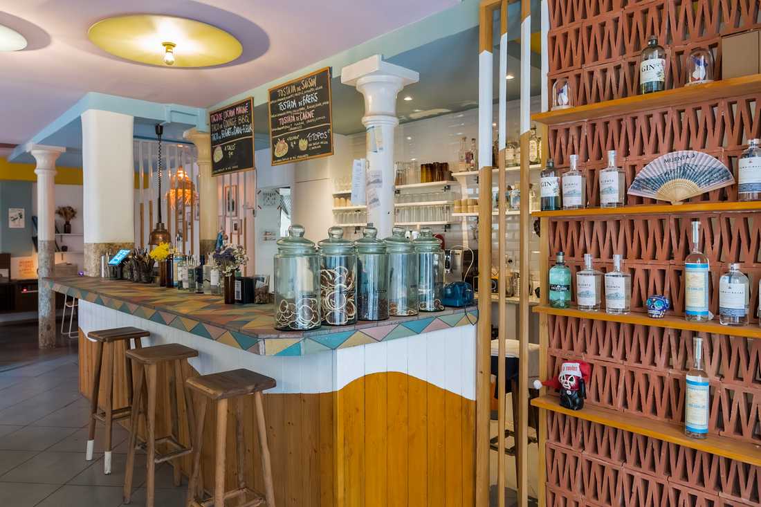
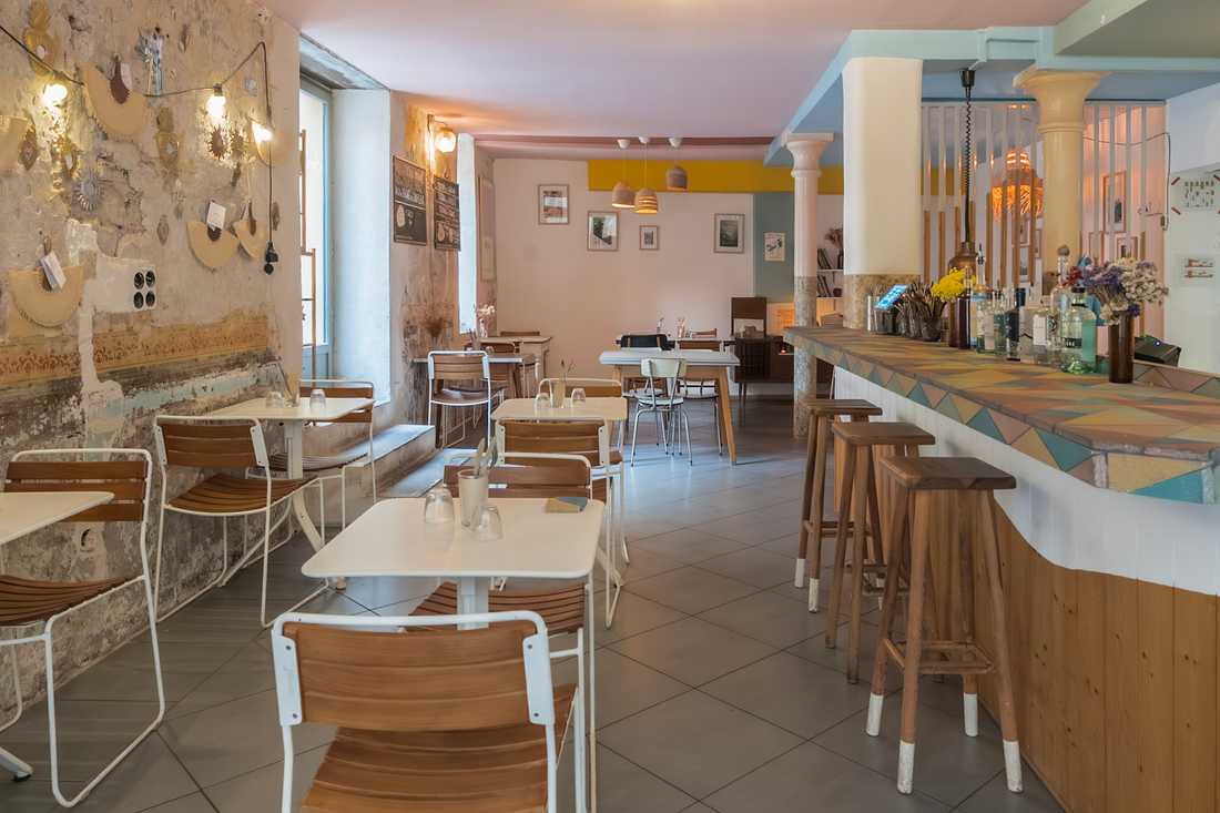
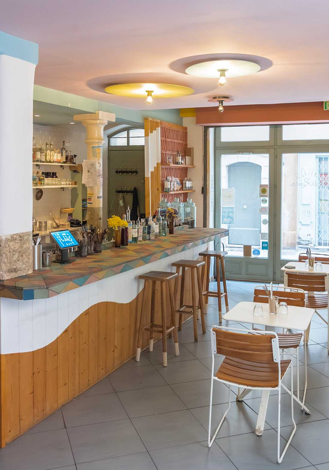
Les propriétaires souhaitaient agrandir le comptoir central pour y intégrer de nouveaux réfrigérateurs et faciliter la circulation derrière le bar, complexifiée par un pilier.
Ce projet d'architecture commerciale prévoyait également la création d'un espace d'épicerie fine à proximité de la caisse, invitant les clients à repartir avec un peu de Santa Rosalia chez eux et à prolonger l'expérience jusqu'à la maison.
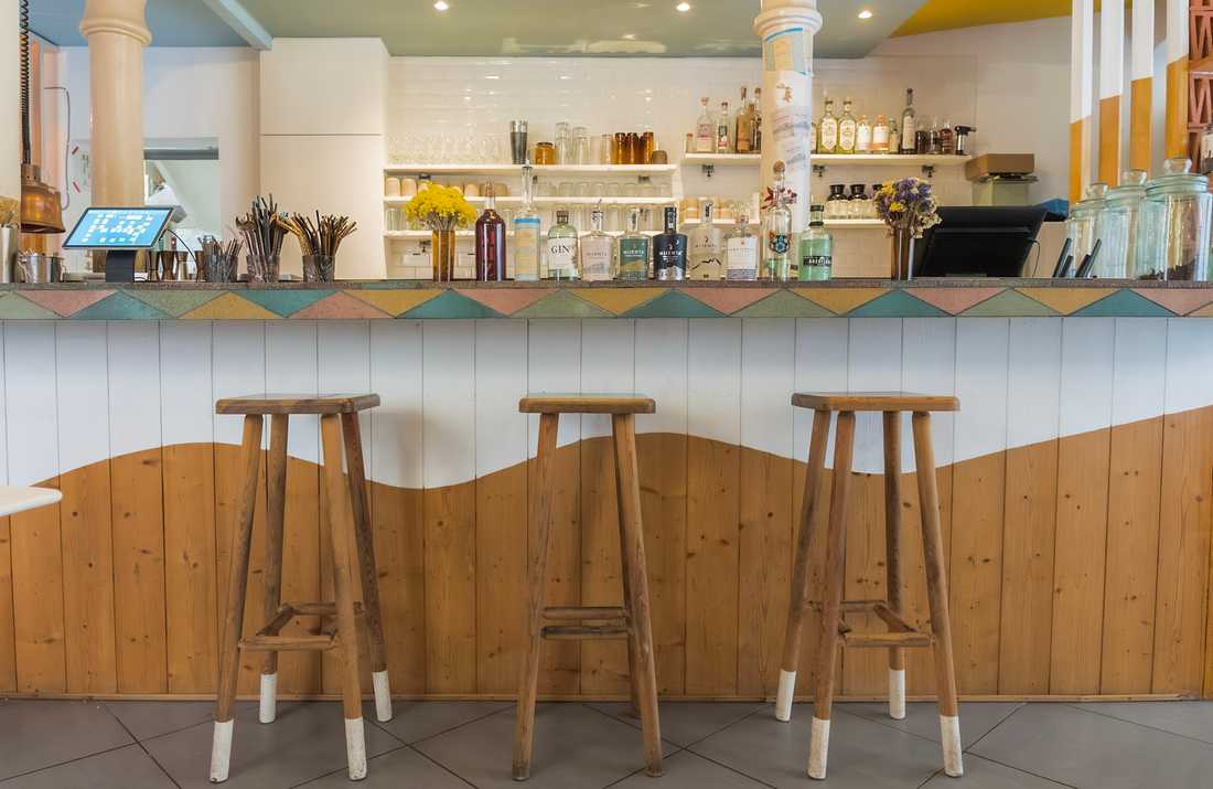
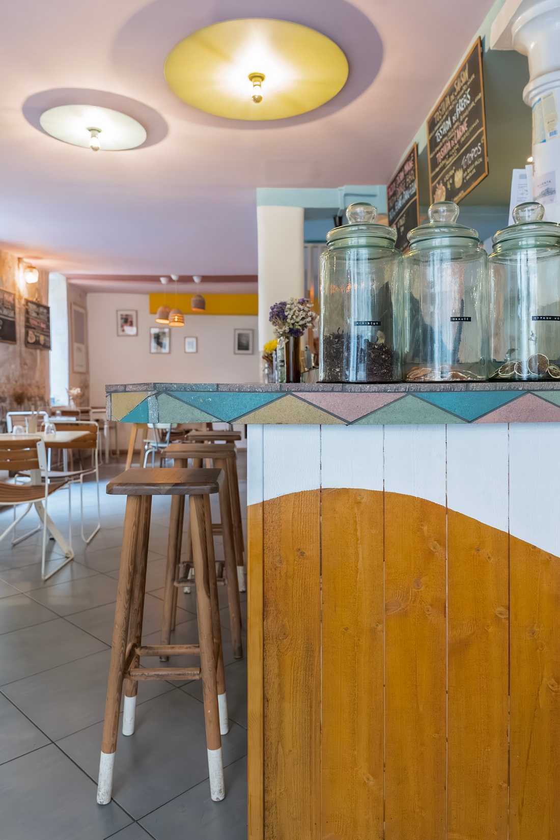
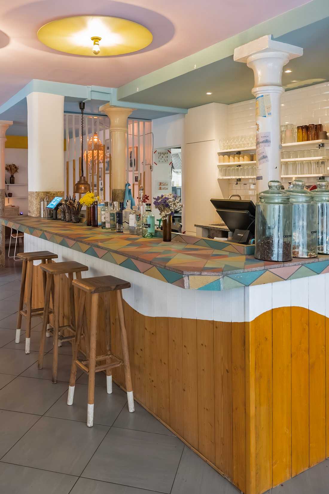
Un revêtement en Pietra Compattata
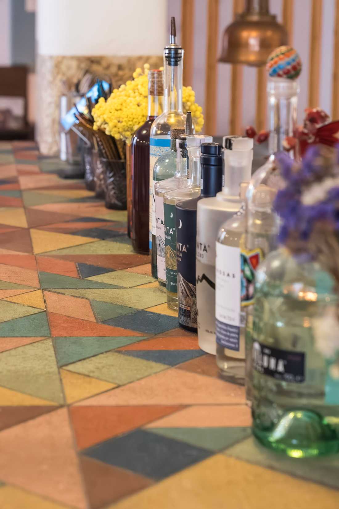
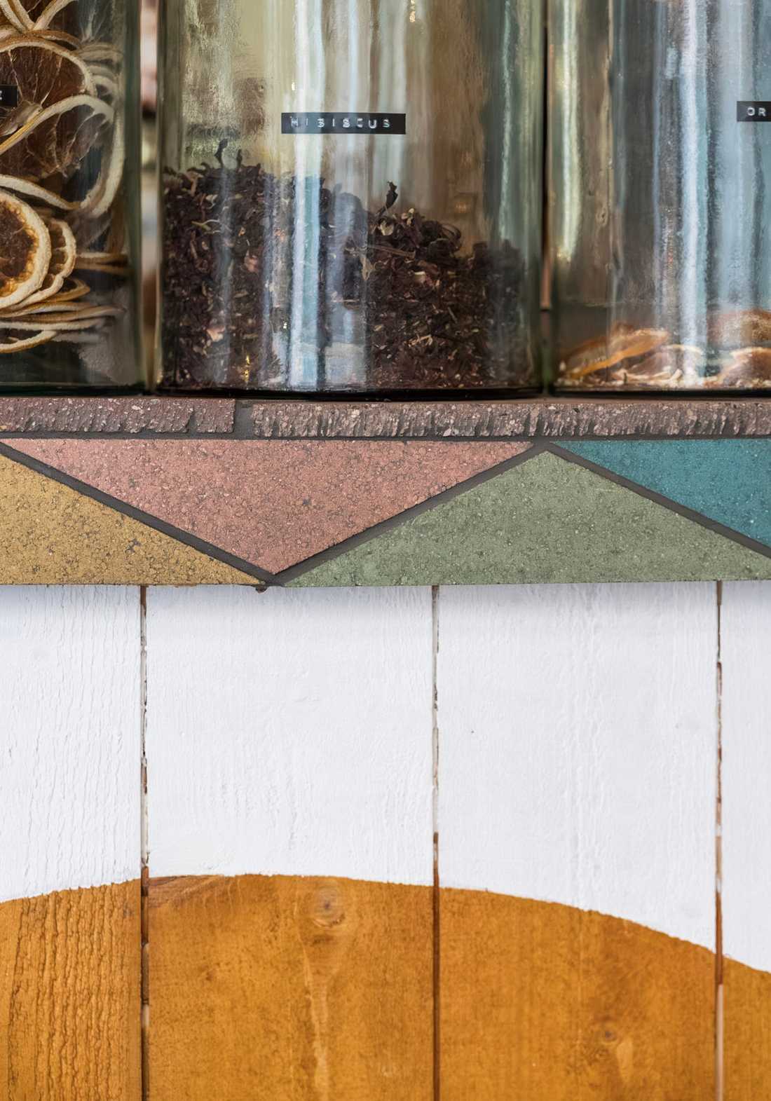
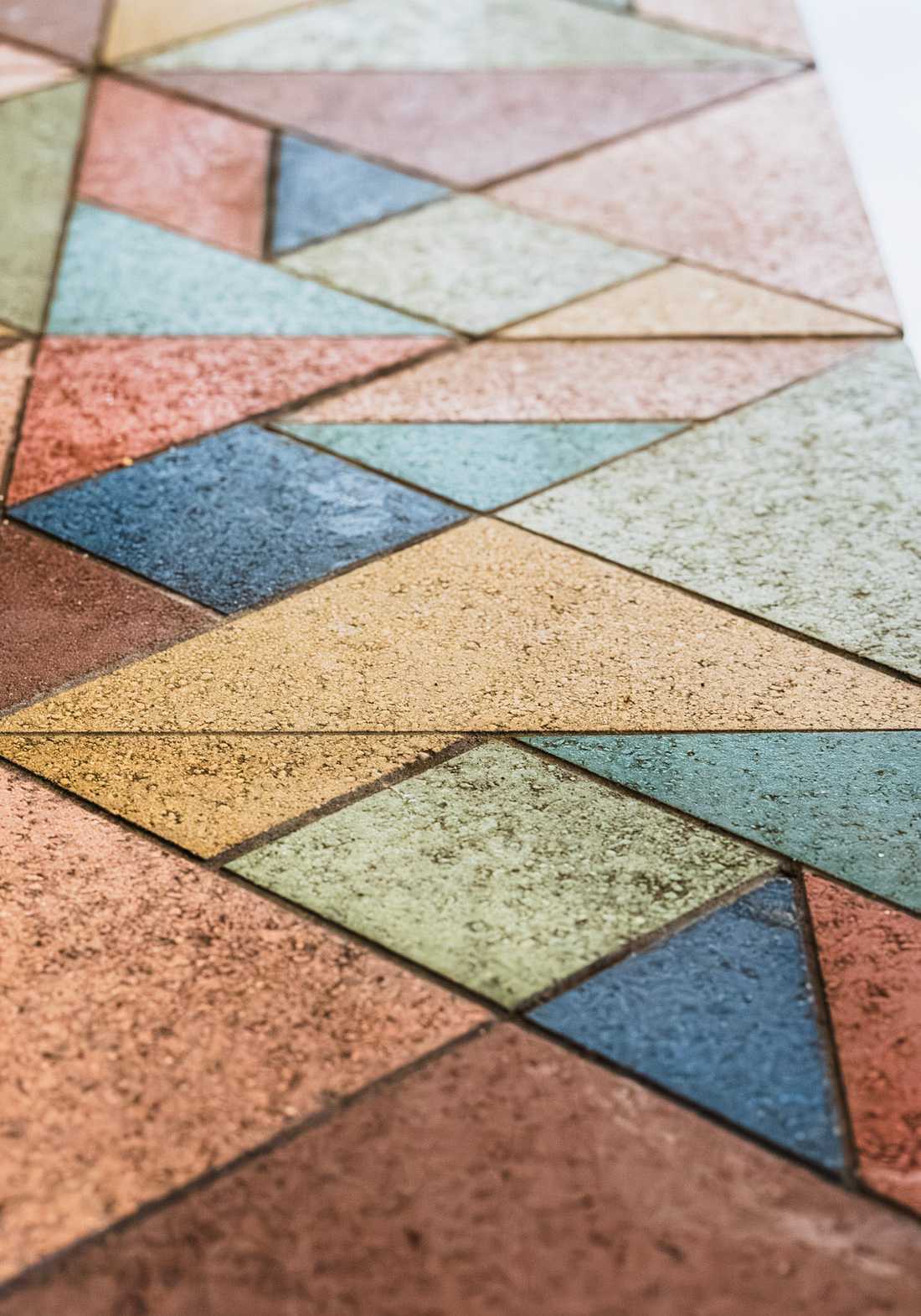
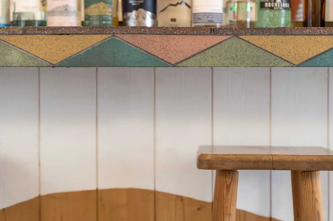
Le cœur du projet porte sur le choix du revêtement du comptoir. La Pietra Compattata s'est imposée comme une évidence : ces carreaux, encore peu répandus, sont fabriqués à partir de chutes de taille de pierre broyées, mélangées et pigmentées. Sans cuisson, leur fabrication s'inscrit dans une démarche écologique (recyclage et économie d'énergie) en écho direct avec la cuisine d'inspiration mexicaine, ancrée dans le local et le bio.
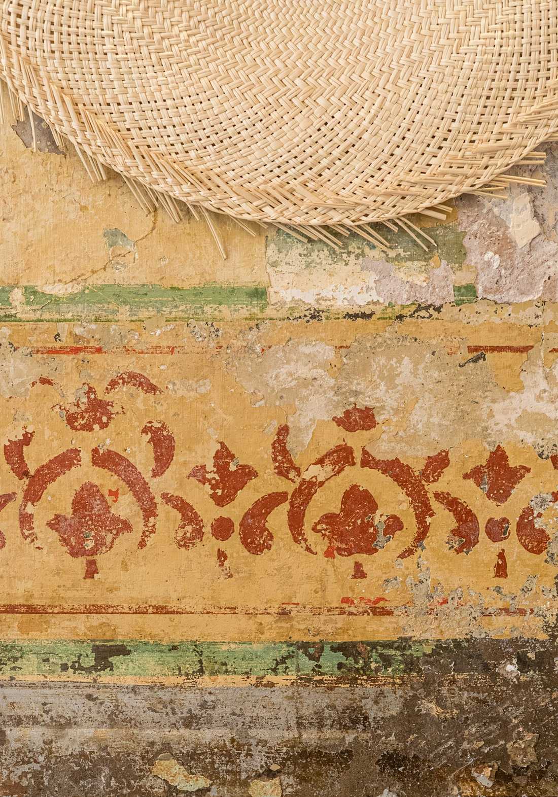
Leur graphisme inspiré du Tangram apporte une dimension ludique, et les coloris ont été choisis en lien avec les teintes existantes : une ancienne fresque découverte lors de la reprise des lieux et les couleurs des piliers en fonte ont guidé toute la palette du projet.
Une mise en couleur cohérente, du sol au plafond
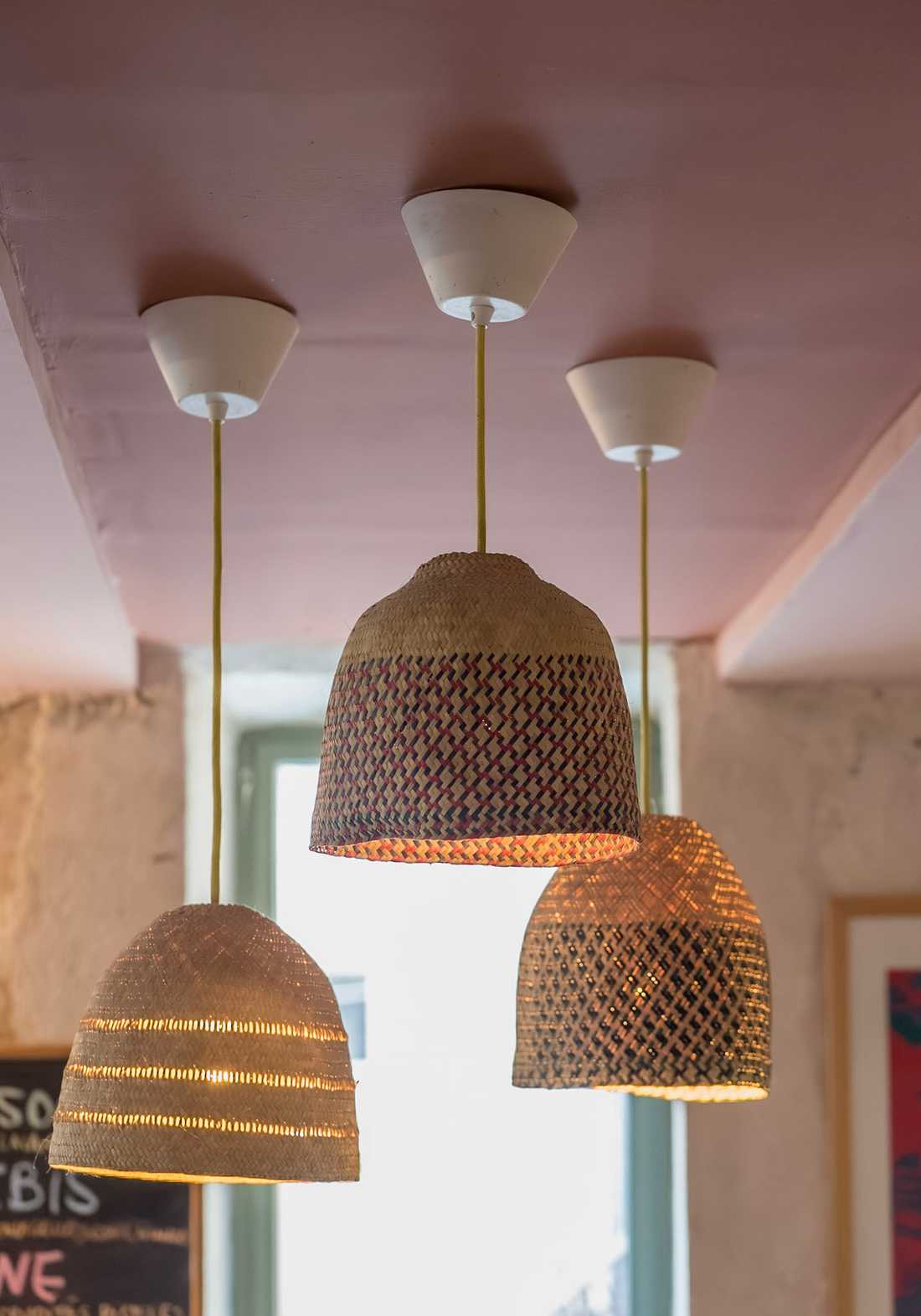
Pour apporter de l'éclat avec un budget limité, le plafond a été peint en différentes couleurs, prolongeant les teintes de la fresque, des piliers et des carreaux. Ce parti pris attire naturellement le regard vers le haut et détourne
l'attention du carrelage gris du sol. Les luminaires Flat d'Aromas del Campo, aux teintes contrastées, soulignent et rythment l'ensemble au-dessus du bar.
La retombée du comptoir, peinte en blanc avec un motif de vague repris du claustra près de la cuisine, crée une démarcation visuelle qui allège le graphisme coloré du bar tout en le mettant en valeur.
Des matériaux naturels et locaux jusqu'aux détails
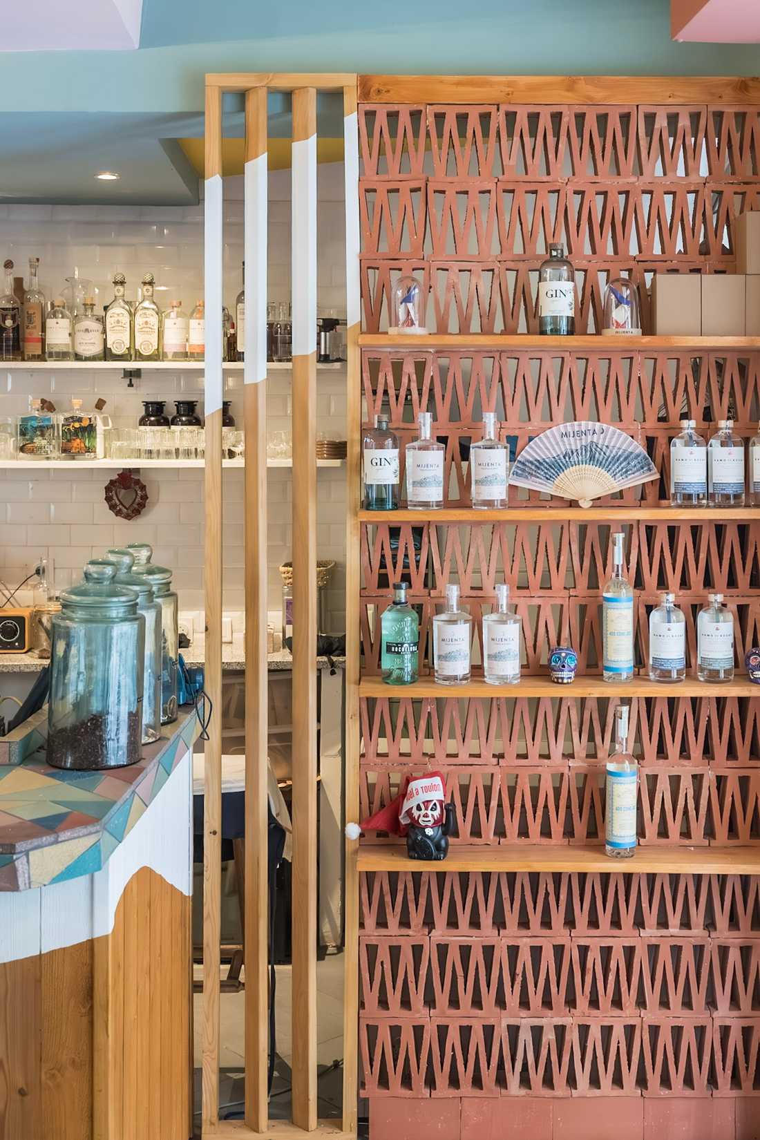
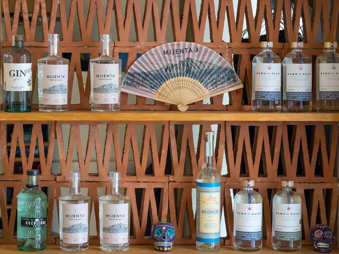
Le présentoir d'épicerie fine a été conçu avec des claustra en terre cuite, dans le même esprit que le comptoir : matière brute, irrégulière et authentique.
Les étagères du bar, repensées pour optimiser rangement et service, sont en plastique recyclé, fixées avec le système de « brackets » de l'entreprise française Tip Toe.
Expanding and Redesigning the Central Counter
The owners wanted to enlarge the central counter to integrate new refrigerators and improve circulation behind the bar, which was made more challenging by the presence of a structural column.
This commercial architecture project also included the creation of a gourmet grocery area near the checkout, encouraging customers to take a piece of Santa Rosalia home with them and extend the experience beyond the restaurant.
A Pietra Compattata Finish
The centerpiece of the project was the choice of material for the counter cladding. Pietra Compattata quickly emerged as the obvious solution: these still relatively uncommon tiles are made from crushed stone offcuts that are mixed and pigmented. Produced without firing, their manufacturing process follows an environmentally conscious approach through recycling and energy savings, perfectly aligned with the restaurant’s Mexican-inspired cuisine, rooted in local and organic values.
Their Tangram-inspired graphic pattern introduces a playful dimension, while the color palette was selected to harmonize with existing elements. An old mural discovered during the renovation and the colors of the cast-iron columns served as inspiration for the entire project palette.
A Cohesive Color Scheme from Floor to Ceiling
To bring vibrancy to the space within a limited budget, the ceiling was painted in multiple colors, extending the hues found in the mural, columns, and tiles. This design choice naturally draws the eye upward and shifts attention away from the grey floor tiles.
The Flat pendant lights by Aromas del Campo, with their contrasting colors, highlight and rhythmically animate the space above the bar.
The front face of the counter, painted white and decorated with a wave motif inspired by the screen partition near the kitchen, creates a visual break that softens the colorful graphics of the bar while enhancing their impact.
Natural and Local Materials Down to the Finest Details
The gourmet grocery display unit was designed using terracotta screens, following the same philosophy as the counter itself: raw, irregular, and authentic materials.
The bar shelving, redesigned to optimize storage and service efficiency, is made from recycled plastic and mounted using the bracket system developed by the French company Tip Toe.