Optimizing an apartment from the 70s
- Dimensions: 73 m² - 3 rooms (including 2 bedrooms)
- Style: Contemporary
- Objectives: optimize space, decompartmentalization
- Study: 2 months
- Construction: 4 months
This 1970s apartment lacked space and modernity. The interior designer transformed it into a warm and comfortable living space for Laurent and his son. An original and tailor-made renovation that met a strong desire to optimize space and make daily life easier.
The owner's wishes: fluidity, light, and minimalism
Laurent, the owner of this apartment located in the charming neighborhood near an urban park, wanted to live with his son in this 73 m² space that had not undergone any renovation for more than 40 years. Like many apartments built in the 1970s, it contained too many doors and excessive partitioning. The renovation required 2 months of study and 4 months of work.
Laurent's initial wishes were multiple:
- Gain space, optimize the layout, and improve the fluidity of circulation in the apartment
- Bring in natural light, one of the apartment's assets, at the right moments of the day while adapting to Laurent and his son's lifestyle
- Adopt a very contemporary, tidy, and minimalist style by "hiding" storage spaces as much as possible
The architect's response: open up and adopt smart furniture
The interior designer was given carte blanche to give this apartment an atypical, contemporary, and warm character.
The first step was to remove partitions as much as possible by eliminating unnecessary walls and doors, in order to optimize the space. The child's bedroom grew from 10 to 13 m², the corridor was removed, and the toilet was integrated into the bathroom, which also gained a bathtub. The wall separating the bedrooms from the living areas was completely reimagined as a modular partition, an original and contemporary way of organizing the space.
The partition, the backbone of the apartment
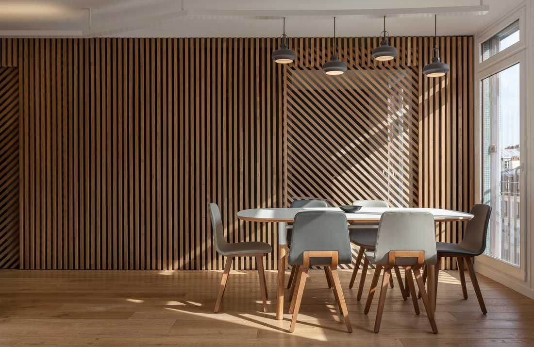
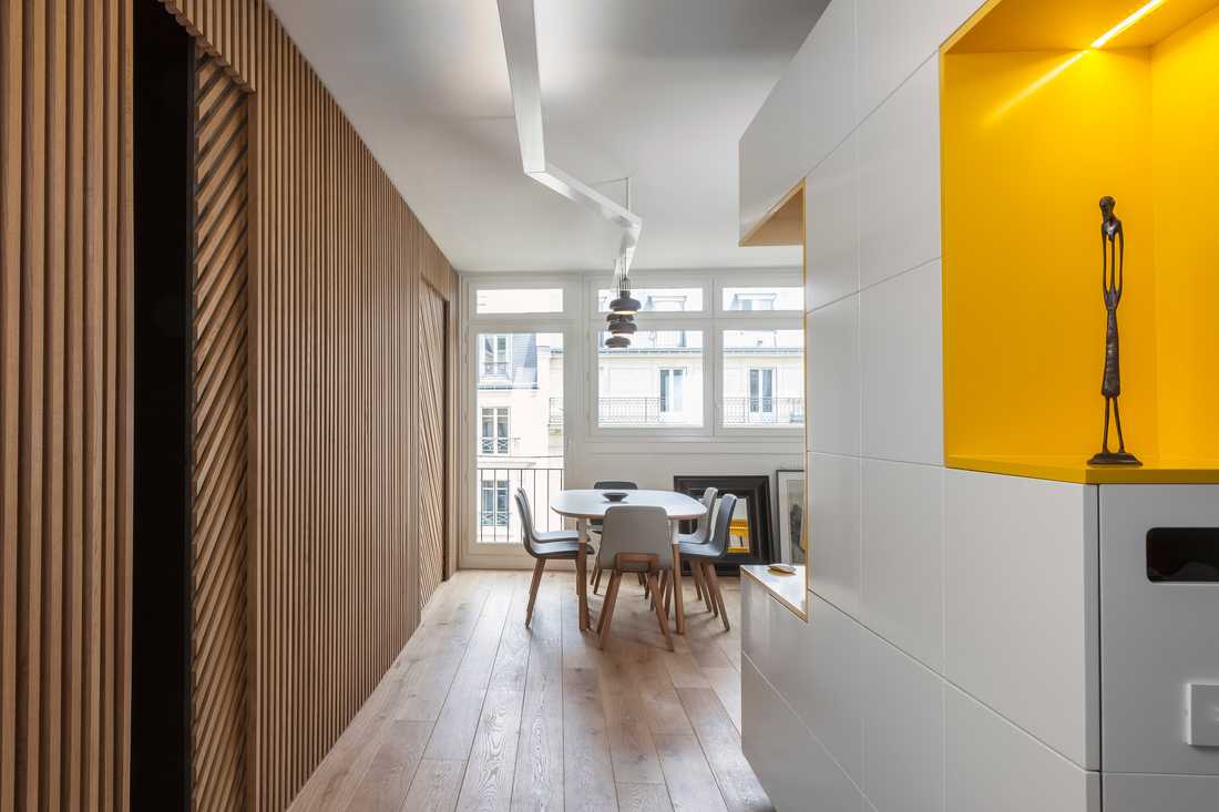
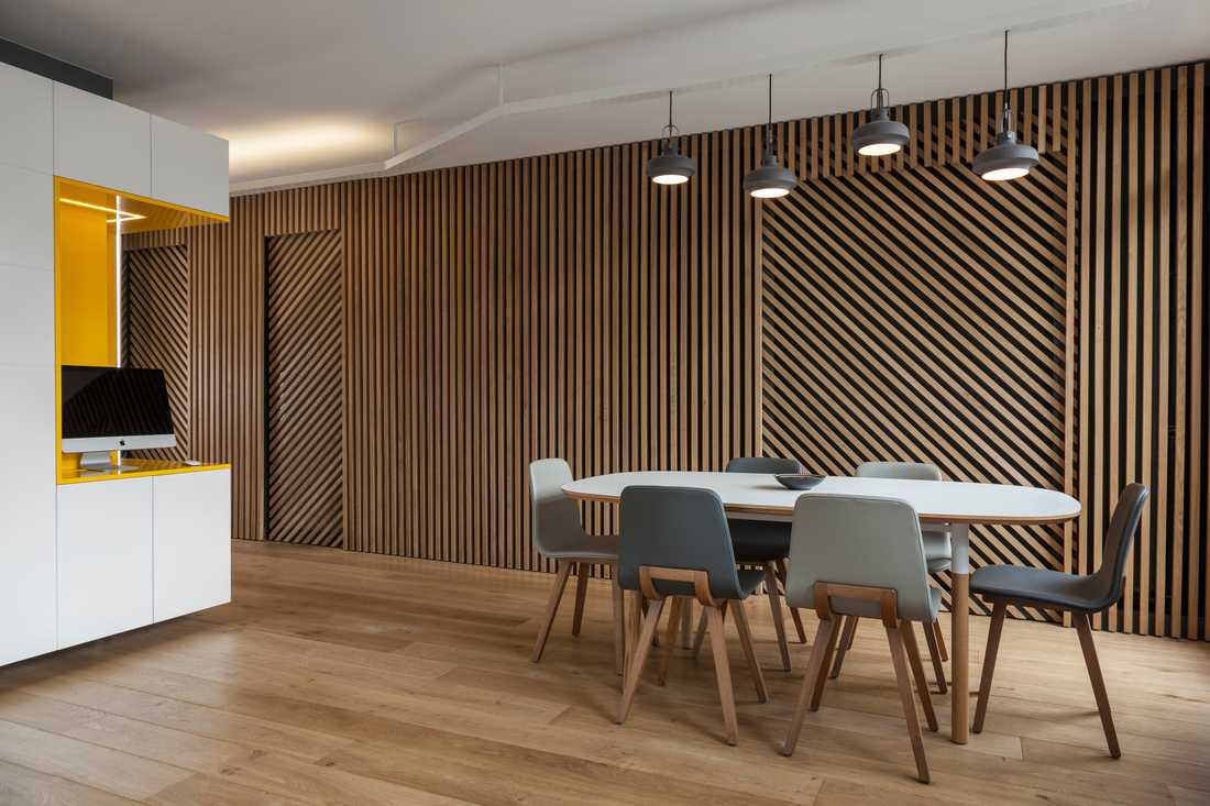
This "animated wall", both lively and graphic, truly became the centerpiece of the apartment. It consists of vertically aligned oak slats along the central partition, superimposed on a black Valchromat support. A so-called "sliding pocket door" (two overlapping panels fixed on a rail) gives it a graphic and arty identity inspired by kinetic art. This new way of separating the living room from the sleeping areas defines the apartment's entire identity. It also fulfills a functional role by allowing natural light to enter or making the master bedroom opaque, depending on the time of day or the desired atmosphere.
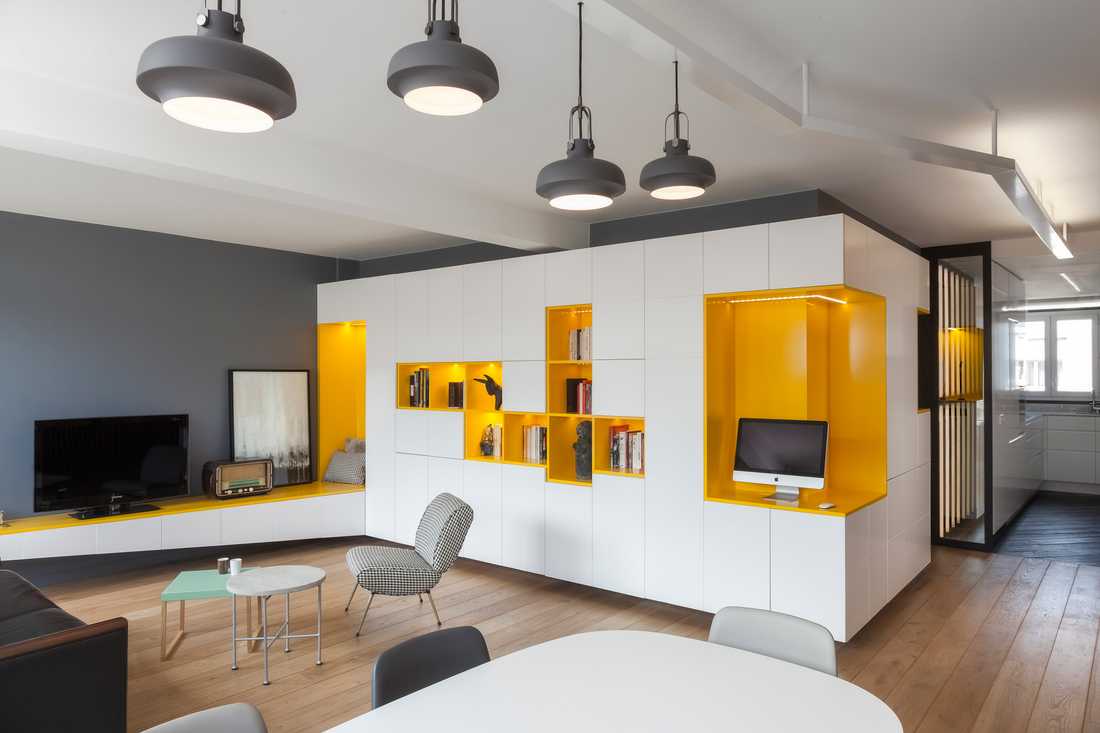
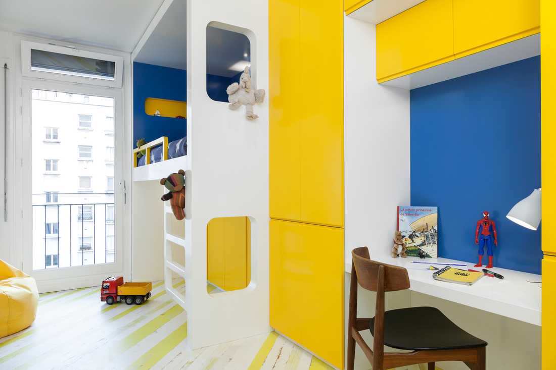
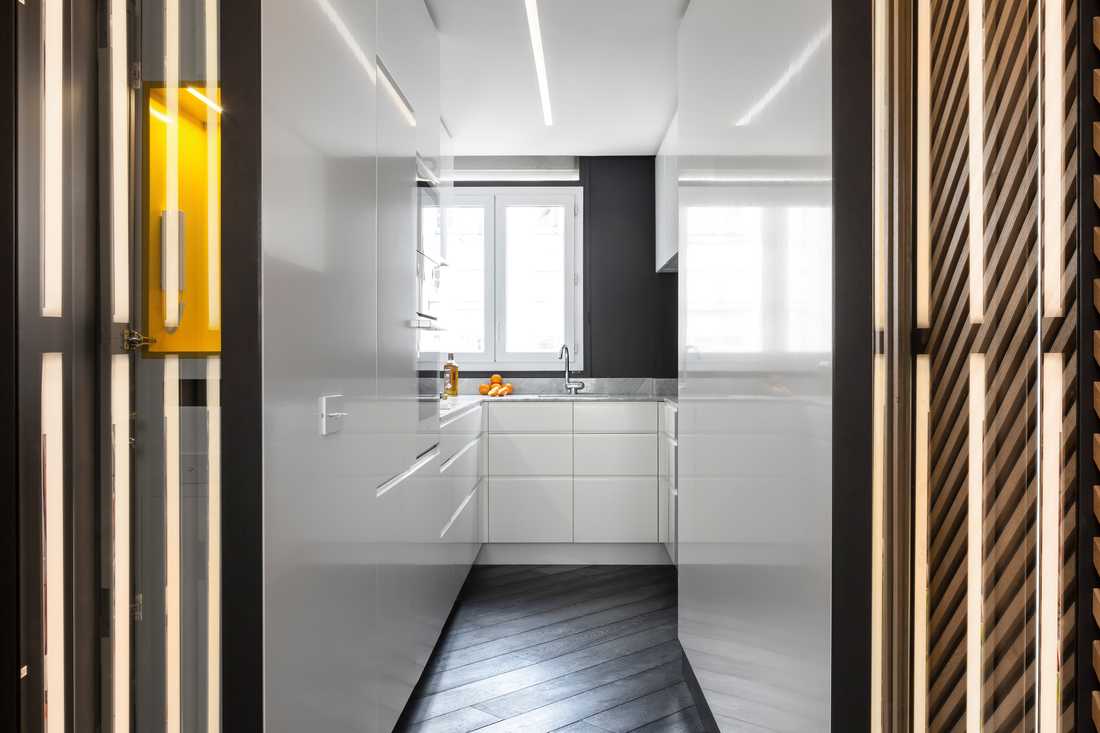
In response to Laurent's desire for minimalism and natural order, the architect chose smart furniture to make storage discreet, even invisible. A large multifunctional unit runs from the entrance to the living room, turning at a right angle. In line with the space optimization strategy, it integrates, for example, a mailbox-style tray, a wardrobe, a desk, and a library. To avoid giving the unit a "massive" appearance and to preserve the desired fluidity, it was raised off the floor and ceiling. In the same spirit, the child's bedroom was fitted with a cabin bed that includes various storage solutions. The kitchen, also redone, was fitted with handleless doors to enhance the sense of space.
As for colors and decoration, the architect opted for energizing yellow accents in the living room. This yellow is made bolder in the child's bedroom. The master bedroom, meanwhile, retains neutral tones. A long custom-made light fixture illuminates the room indirectly, with light sources directed toward the ceiling.
In the kitchen, the satin dark gray wall paint recalls the tones of the black oak flooring.
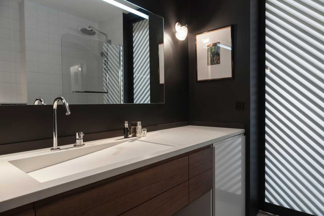
In the bathroom, a simple basin echoes the simple and uncluttered identity of the rest of the apartment.
Learn more about this renovation:


